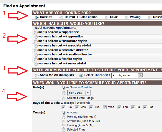
For service-based Web sites, you often live and die by your ability to convert people through your online form. Whether the form is intended to get their information for a follow up call, to allow them to register for an online or physical event, or just to send them a free product or subscribe them to your newsletter, it’s a Must Hit conversion point your Web site can’t afford to mess up. Get them there and convert them and you get to keep playing. Lose them and they’re gone forever.
If you’re analytics are showing that customers are getting to your online form but aren’t converting, it may be time to figure out why. Here are some common mistakes businesses make with their Web forms, all displayed through one awesome example.
Check out the online appointment form for an organic hair salon located in Troy, NY. The good parts are numbered.

1. Don’t let them do what they need
No one likes feeling stupid. If I land on your site with a mission and you don’t allow me to accomplish it, I feel like I did something wrong. And then I’m going to run to Twitter and tweet about how worthless and emo this makes me feel. The radio options on the form above only allow me to select one type of service to make an appointment for. If I want a haircut, a massage or a styling, then this form works for me. But if I want to have a spa day and get all three, well, I’m out of luck unless I want to go through the process three separate times. And I don’t. Because as you’ll soon see, the process itself isn’t so easy.
Anticipate what it is your customers will need when filling out their form. I’d also recommend doing some user testing to watch how customer’s interact with your form. You’ll get their thoughts straight from their own mouths.
2. You’re using jargon I don’t recognize
This is a really big problem for sites. As an expert in your field, you’re naturally going to use different language when referring to things than an everyday user. As a common person, I’m not sure what the difference is between an apprentice, an associate stylist, a senior stylist and a creative director. I have some level of intelligence so I can grasp the hierarchy being laid out, but I don’t know what that means in terms of price differential, availability or time. I may not want a n00b cutting my hair, but I also don’t want to pay $500 an hour for the creative director of the shop to squeeze me in. Or what if I’ve been here before (which I have), how do I know what title “my girl” has? I don’t.
Whether it’s your online form or the rest of your Web site – remember that you are not the customer and it’s not your likes and wants that matter. It’s theirs. You only matter if you can give them what they want in the way they want and understand it. Use the words they know and are looking for.
3. Be consistent
Up above I’m asked to select if I want an apprentice, a stylist or a creative director. Suddenly, that language is gone. Now these people are referred to as therapists. Or maybe they’re not. Maybe a therapist is something different to this salon. I don’t know. Again, I’m left to feel dumb. And because you just assumed I needed a therapist now I WANT TO THANK YOU FOR JUDGING ME!
If you’re selling [rain boots] on your home page, don’t start selling [wellies] on your interior product pages. Because while they’re technically the same thing, they’re not the same to a customer who came looking for [rain boots]. Know what terms you’re customers are going to be looking for and use them. And once you know – stick to that term. Save your creativity for other areas.
4. You ask for more than you need, with too many options
For someone looking for a simple haircut, this form comes off as a little intimidating. There are too many options, too many ways to get to the same destination, and too many places to get utterly and completely lost. I haven’t seen that many options to fill in information since I look at my SAT Scantron. And I’m pretty sure I misnumbered that monster, too.
I know it’s tempting to squeeze as much information as you can from someone while you have their attention – but show a little restraint and only ask for what you absolutely need. Otherwise you run the risk of someone getting turned off, distracted or just too annoyed to make it to the end. If you don’t need someone’s full name, address, date of birth, SSN, astrological sign, pant size, favorite number, and name of their HS principal, don’t ask for it. Get what you need to take the relationship to the next level, and then ask for it once they trust you.
The online form on your site should not act as a hurdle. It should be welcomed, intuitive, and the building block for the rest of the relationship to form. When it comes to Web forms,
- Keep it simple.
- Make it intuitive.
- Don’t start a relationship and propose in the same step. This is not a Hollywood marriage – build slow.
Easy, peasy, without the TSA cavity search. What are your online form pet peeves? Sound off in the comments.


