Oh, the possibilities for swimming puns related to site navigation are endless! I’m going to assume you can see the parallel, and just get right down to the good stuff. One of your jobs as a Web site publisher is to figure out what brings people to your site, and make it easy for them to find it. While it may be tempting to create a site with tons of bells and whistles, when it comes to site design, architecture, and overall usability, less is definitely more.
While everyone has their own ideas about things like color and images, a few key elements should remain consistent on any site you build. Before you even think about how to build links to your site, you need to make sure people will find it useful once they get there. Here are my tips to help keep things going swimmingly. (Sorry, I couldn’t resist.)
Use Global Navigation
This isn’t as complicated as it may sound. Basically, it just means keeping the navigation in the same place on every page of your site. If the home page has top navigation, that element shouldn’t suddenly move to the sidebar on the category page. Your visitors shouldn’t have to go looking for the nav menu every time they land on a new page. It doesn’t matter whether you choose to use top nav or a sidebar menu, just keep it in the same place from page to page.
Make Clickable Elements Stand Out
Most sites have gotten away from underlining text links, but they should still be in a color that sets them apart from the rest of the text, preferably a bright one. They won’t do you any good if people just skip right over them. If you’re using any kind of buttons or other graphical elements on the page, they also need to stand out. That three-dimensional keyboard button look may seem a little outdated, but compare the clickthrough rate on one of those to a flat, dull-colored square, and I’m willing to bet the 3-D button gets better results.
Use Breadcrumbs
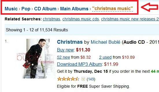
Who knew the Brothers Grimm would eventually influence Web usability? Much like those fabled breadcrumbs left in the woods, Web site breadcrumbs allow users to see the path they’ve followed to get to the current page, and to easily find their way back, should they wish to do so. Breadcrumbs can also aid in the addition and naming of site links. They look like this:

You can easily see what page you’re on, what page you were on, or you can even go all the way back to the beginning if you want to start over and look for something else. But come on, how could you possibly need anything else once you’ve found the Michael Bublé Christmas album?!
Edit Text Mercilessly
This one is my favorite. All sites need at least some text, but most people don’t really read all the text on Web pages. They scan it for the information they’re seeking, and when they don’t find it, they get frustrated and either start clicking around aimlessly, or they leave. Either way, you’re not doing your audience any favors by being too wordy. Unless your site is a blog or a news outlet, burying your site’s purpose in a bunch of text is only going to increase your bounce rate.
But on an e-commerce site, for example, the longest bits of text should be confined to product descriptions, and even then, they need to be concise, giving the shopper enough information to make a good buying decision, but not going overboard with adjectives and flowery prose. Amazon.com is a great example of this (I swear I’m not shilling for Amazon, they just have an example-rich site!). The site does have several elements on each page, and a lot of information, but it’s presented in clean, useful blocks, and they make good use of white space, which is not the evil wasteland some site owners seem to think it is, which leads them to do this:

Don’t do that. If you take nothing else away from this post, let it be that. Please. The Internet will thank you.
There’s a lot more that goes into making a site fully functional from a usability standpoint, but these tips should get you started. What usability tips do you have? Share them in the comments!
P.S. Only a few days left in our 12 days of SEO! Can’t remember what comes next on the list? To help, I give you the Muppets, because it’s just not Christmas without Muppets, am I right?

