Your Web site tells me a lot about you. It tells me who you are, what kind of customer you’re attempting to attract, the vibe behind your company, and sometimes, that you’re a blind man living in the year 1987.
Bad Web site design can happen to anyone, but it doesn’t have to happen to you. The trick is to design a Web site that will attract the people you’re trying to sell to. To create a design that will attract your “clique” and the type of person you want to use your site.
Lisa, you say, what does my Web site design really matter if my product is good? Who cares if I’ve designed a Web site that is pink, uses stripes and wreaks of glitter? People will look past it to get to my awesome product.
No. They won’t.
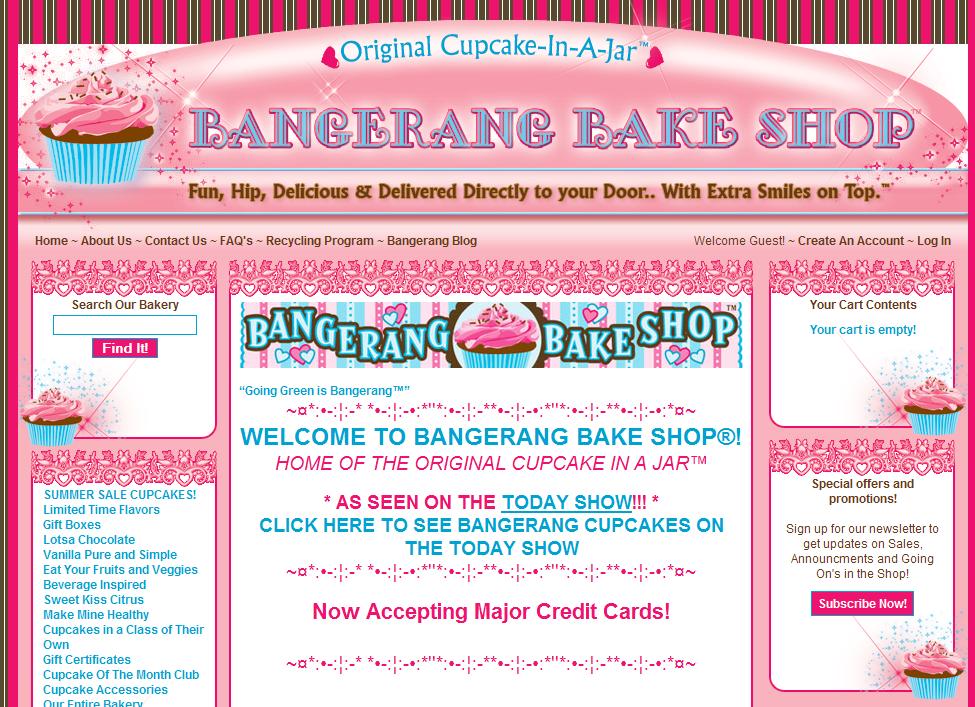
Meet Bangarang Cupcakes.
I know. It looks like a faerie threw up all over your monitor.
What you may not know is that I used to be a huge evangelist for Bangarang Cupcakes (formerly Fat Daddy Cupcakes). I pimped their $6.50 cupcakes all over the Internet. At the time, they were simply an Etsy store. I fell in love with them and their cupcakes hand carved by angels. But then they rebranded to Bangarang Cupcakes and came out with that Web site. And as much as I hate to say it, I’ve stopped visiting.
I don’t visit the site because it distracts me from what I was intending to do – Buy cupcakes. Now when I go there, all I can see is a neon hot mess.
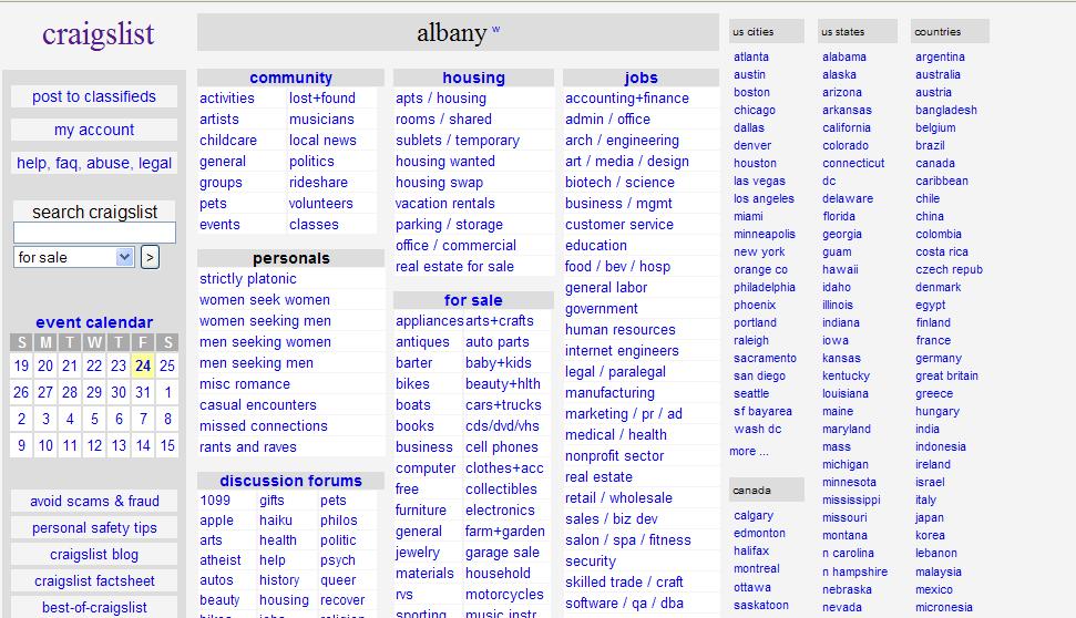
Don’t get me wrong. It’s okay to be ugly! Sometimes being ugly makes your point and works for what you’re trying to do. For example, the two sites below are some of the ugliest sites on the Internet. But they both work exceptionally well.
The Most Amazing Web Site On The Internet (thanks to Tim Obarski for this one)
These sites are the good kind of ugly. Their ugliness enhances what they’re purpose. Yes, TMAWSOTI may induce a seizure, but that’s the market they’re going for. Craigslist may be boring, but when I land on it, I trust it. I trust that it’s credible, that it’s a real site and that I’m not going to get swindled.
However, it’s not okay to be ugly when your ugly distracts people from what they were trying to do and drives them away from your site.
Businesses need to realize that their sites aren’t about them. Your Web site should make your customer feel comfortable using your site. It should enhance the goal and whatever it is visitors are there to do. The Bangarang site doesn’t make me want to buy cupcakes. I don’t even see their cupcakes til the tail end of the page. Instead, I’m blinded by the pink, the $11.99 site design, and who they could possibly have on staff that thought that was a smart idea. I immediately don’t trust them. So I just leave.
Using a credible site design is the single best way to establish trust on your Web site. And with all the free WordPress themes and resources available to you today, there’s no excuse for bad design and sites like Bangarang. The tools you need to build a competent looking site are out there. Or, if you can’t do it yourself, hire someone who can help you. Someone who will listen, who will make your content the focal point and not douse your site with cascading unicorns.
Your Web site is how people will first judge you. It’s not an area where you want to cut corners. Use your Web design to build your clique, naturally attracting the people who should be attracted to you. I love frosting. I should be attracted to the Bangarang site, but with that design, all they’re doing is pushing me away. Which is shame, because I make a pretty powerful brand evangelist.
Ask yourself, does your Web site design encourage users to take the actions they need to on your site or does it distract them and push them away? Don’t let ugly Web design happen to you.


