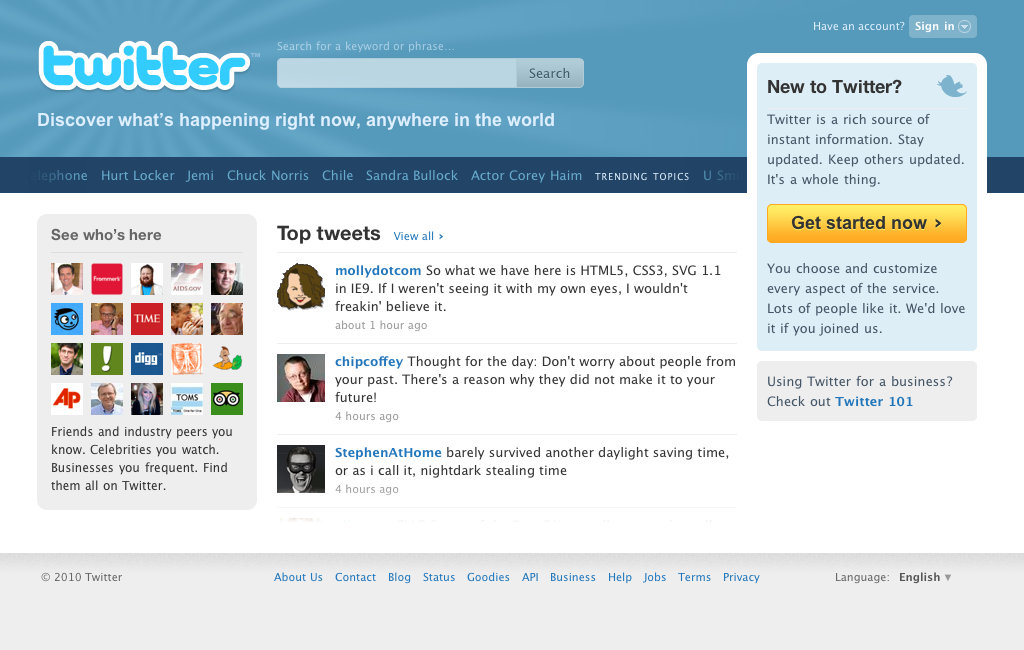
 See that up there? That’s the new Twitter redesign that was launched yesterday. Not exactly earth shattering news, but it’s pretty neat. The change was announced by Twitter’s Creative Director Doug Bowman who explained a bit about the reasoning behind the redesign.
He wrote:
“With the new design, we’re intentionally featuring more dynamic content on the front page, revealing a sample of who’s here, what folks are tweeting about, and the big topics that they’re discussing. The homepage now features a set of algorithmically-selected top tweets that automatically appear every few seconds”
I like it. In fact, I like it a lot. Here are five reasons why Twitter’s new home page is better than yours and what you can take from it to apply to your own site.
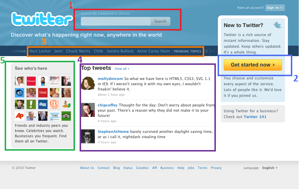
1: Prominent Search

Twitter does an awesome job prominently displaying its search bar so that its absolutely impossible for someone to skip over it. A user who lands on your site unsure of what to do will immediately head for that little bar. It’s a trained behavior and Twitter knows that. They also know that some people may have questions as to what Twitter is and why they should care. If you’re not prominently displaying the search bar on your site, you’re giving people license to hit the back button on their browser and go somewhere else. Probably to a competitor. Where they will spend a boatload of money.
Where is your own search bar located? Is it above the fold? Is it easily identifiable as a search bar or are you being confusingly creative? Does it stand out on the page or do people have to really squint to distinguish it? If it doesn’t stand out and you’re making people hunt – you need to fix it. Because people aren’t going to hunt for you. They’re going to leave you. People always leave.
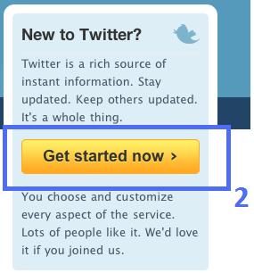 2: A Single Call To Action
Users aren’t bombarded with a whole lot of options when they land on the Twitter home page. There aren’t links to everything they could possibly do or read about or see. They’re not trying to write the Book of Twitter on one page. Instead, there’s one main link that takes precedence over all the others. It’s the call to action designed to entice people to Get Started Now and create a Twitter account. That is the single most important thing that Twitter wants people to do and that is what they highlight and where they direct user’s attention. People aren’t left stranded. They’re given a life boat and a flashlight.
What does your own home page look like? Have you carved out a path to get people through your site and to a desired location? Or, instead, are you throwing everything you have to offer at them from the very beginning and hoping they’ll take the time to discern what’s what? Figure out what it is you want people to do and then push them toward that. Users don’t like to think. They like when you tell them what to do. I know it sounds like more options are all the rage but, really, they’re not. People don’t want to choose.
3: Identifies Trends
![]() If you’ve never heard of Twitter, it probably sounds pretty odd. It’s just a bunch of strangers talking about themselves and the topics they’re interested in, right? I mean, who cares? What does that offer me and what could I possibly have to offer to that conversation? If you don’t know, Twitter gives you an easy way to find out by spelling out the hottest site trends directly on the home page. Someone can click on [Sandra Bullock] and read about the conversation going on about her. From that, they can learn a bit how the site works, see how people are interacting with one another, and it gives them fodder for that intimidating first tweet. Twitter immediately opens the door to get people interacting and helps get rid of that “is this thing on” feel. Users are immediately puts people into the conversation.
If you’ve never heard of Twitter, it probably sounds pretty odd. It’s just a bunch of strangers talking about themselves and the topics they’re interested in, right? I mean, who cares? What does that offer me and what could I possibly have to offer to that conversation? If you don’t know, Twitter gives you an easy way to find out by spelling out the hottest site trends directly on the home page. Someone can click on [Sandra Bullock] and read about the conversation going on about her. From that, they can learn a bit how the site works, see how people are interacting with one another, and it gives them fodder for that intimidating first tweet. Twitter immediately opens the door to get people interacting and helps get rid of that “is this thing on” feel. Users are immediately puts people into the conversation.
Go back to your own site: Are you encouraging people to enter or are leaving them out in the cold to figure things about on their own? Look for ways to quickly integrate your users into the mix so that they feel invested in the community you’re creating. The more seamless you can make the transition from lurker to participant, the more value they’re going to bring to your community and the louder they’ll be about their engagement there.
4: Easy Engagement
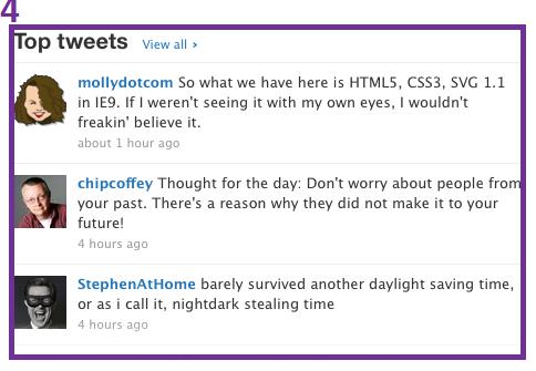 Keeping with the theme of quickly integrating users, Twitter has adopted a Top Tweets widget that uses an algorithm to display some of the most popular current tweets on the site. Doing so introduces new users to some of the people they’ll meet, shows them how others are engaging and what they’re talking about, and it leaves something for users to interact with. It hooks people from the home page and gives them a window to what’s happening inside.
What are you doing to make your own home page more social and to get people in the mood to interact? Are there links to your current blog posts? A widget to display your site’s most active users? A look at your own Twitter feed or your Facebook profile? The more dynamic content you can include on your site, the easier it’s going to be to grab people from the home page and get them deeper into your content. Twitter’s doing a good job with theirs. How about you?
5: Social Proof
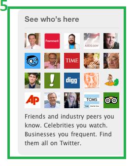 The new Twitter home page immediately introduces new users to twenty people already using the site to offer some social proof. Those people are already using and finding value in the site, so maybe you’d find value in it is as well. If you saw that 10,000 people had already joined a community, you’d probably feel more comfortable joining than if that number was more like five. We want to be where the party is and where the cool kids are already hanging out. If those twenty people are finding value in the Twitter community, than that makes me wonder what’s going on over there. And hey, maybe if I join, Twitter will put MY face on their home page and tell the world how cool I am for being part of the club.
By displaying and highlighting those in your community, you give others a greater incentive to join. What kind of social proof are you offering on your site? Maybe it’s a Facebook Connect widget or a chicklet that displays your RSS.email subscribers or Twitter followers. Perhaps it’s a sign of all the press mentions you’ve earned or where you’ve been featured. Show people that you don’t live in a bubble and that other people have found a great deal of value in your site.
I really like the new Twitter redesign because I think it highlights a lot of areas that are important, and yet often overlooked, by site owners. If you want to improve the homepage on your site, than consider taking a lesson from Twitter here. Focus on creating dynamic content to draw people. Get to know your users and create content that specifically address where they are on their mission and how they can benefit from spending time with you. At the end of the day, it’s all a value and trust game. You have to prove you’re worth their time and that you have something you can offer them.
Do you? How are you showing them?


