It’s funny how clients’ needs evolve over time. For example, I’ve been noticing that most clients who come to Outspoken Media seeking blog consulting services these days aren’t asking whether or not they should take the plunge and create a corporate blog. In 2012, they’ve already got that. Now what they’re looking to do is get more from that blog. They’re looking to hire a social media agency to help them increase engagement, usability and the overall function of their blog. I’m lucky that many of these audits and strategy documents fall on my plate, which means I get to look at awesome blogs and make them even more awesome. Who wouldn’t love that?
When I’m creating recommendations for those blogs, below are a few of the features I keep an eye out for. While there’s obviously way more things that go into constructing a great blog, the ones mentioned below have a high bang-for-the-buck ratio.
1. A Prominent Subscribe Button
I mean, it makes sense to start here, right? If you’re spending time to create a blog, you’re doing so because you want people to find, share and love the content that you’re putting out. For that to happen, people need to know that new context exists. One of the easiest ways to provide this information is by encouraging readers to subscribe to your blog via a prominent call to action. Do not hide that thing at the bottom of your page. Put it front and center so that people trip over it when they land on your site.
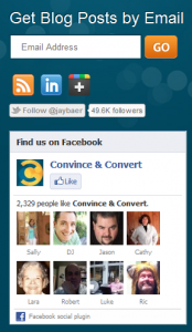
And don’t be a discriminating jerk – make sure you’re also allowing people the option to subscribe via email. Not everyone lives inside their RSS reader. Some people can’t even spell RSS. I like how Jay Baer does it over at Convince & Convert.

2. Links To Your Other Social Profiles
Like most girls my age, I am a very good stalker. I can find information about you online that would make your poor mother weep. But all the same, why make me work for it? Right below your icon to Subscribe, I want to see all the different ways I can find you in social media. I want your Twitter, your Facebook, your LinkedIn, your YouTube, and whatever other social profiles you want to hawk. And I want it easily visible and accessible. If you’re active somewhere, I want to see it. Just because I can find it on my own, doesn’t mean you should make me. The more ways we can hook up, the better.
For example, I muchly appreciate it when people like Erika Napoletano not only give me the stalking materials I need, but they don’t judge me for it.

3. Post-Level Social Sharing Icons
Don’t forget to include the sharing options on the post-level, as well. You don’t need to include a link to every site you have a presence on, but take a look at your analytics and see which sites you get traffic from and where your community is already hanging out. These are the icons you’ll want to include so that readers can submit and share your content while they’re deep inside it.
For example, if you’re blogging about killer handbags (like cool ones, not ones that murder people…) you want to add a Twitter button, the option to share on Facebook, to pin it on Pinterest, etc. Don’t NASCAR things up, but do pick the ones that make sense for your community. Sharing starts post-level.
4. Category Pages
No one is reading through your archives by date. It’s not a natural search function to spend a couple minutes (hours?) checking out what your favorite blog had to say in March of 2007. It’s a lot more likely that someone will be interested in checking out everything you’ve posted about online reputation management. Or zebras. Or the benefits of self-publishing. We search by topic. We do it by category. Why not get more from your archives and build out category pages to search as topic-specific landing pages?
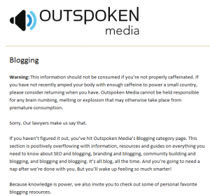
If you’ve spent much time browsing the Outspoken Media blog, you may already know we use Thesis to create user-friendly category pages. If you’ve never peaked, here’s a snapshot of our blogging category lander:

From a user standpoint, they help introduce a topic, provider resources, and list out everything we have to offer on that subject. Of course, from a search standpoint, they give us something else to build links to and help rank. And people seem to like them.

5. Popular/Most Recent Posts Displayed
It doesn’t matter to me whether you choose to display your most popular posts, your most recent posts, the posts with the most active comment discussions or just a series of random posts you came up while sleeping – I just want to see that you’re giving users something. I want to have instant access to a life point on your site. Somewhere I can go to get a taste of what you have to offer and posts that others have found valuable. It gives me a taste of what you’re about, what riles up your community, and a reason to want to get to know you better. It also immediately inserts me into your site’s conversation. Once I get in, I may never leave. You do want to keep people on your site for longer, yes?
6. Feature Box
You’re always up to something, aren’t you? Whether it’s a new eBook, a new training series, a new list of events you’re getting ready to attend – there’s always stuff going on that you want to highlight. Creating a feature box where you’re able to call attention to these types of things can be really effective.
Chris Garrett does it in the form of a “free gift”

But it doesn’t have to be a gift or free. Selling something? Let it spend some time prominently featured on your blog. We like it when you give us a little tease.
7. Thanks For Commenting Pages
Do I often come across this? No. Which is why YOU SHOULD DO IT! I’ve written about how we use our Thanks for Commenting page to shock and awe people and the truth is, it really does. It’s such a simple, simple thing and it drives people bananas with gratitude that we’ve taken the time to acknowledge them and say hello.
Like I said, the blog audits we produce for clients are obviously far more in-depth than this quick rundown, but the above are all features that will give business bloggers some quick bang for their buck.


