 I’m not going to lie – I don’t really love infographics. Seeing them constantly flood through my Twitter stream fills me with an unwavering urge to stab myself in the face just so I don’t have to see another one. But as Sonia Simone reminded us in a recent interview, it’s okay that I don’t like them. Because I’m not normal; I’m a marketer and a hyperconsumer. Normal people love infographics. They love them so much because they like being given information in consumable, visual chunks. They want to read as little as possible, while still being richer for the information.
Okay, maybe I do, too. We all do.
Danika walked us through some great tips on how to create infographics on the cheap. But sometimes, despite the best data and available tools, our infographics and data visualizations sort of, well, flop. Below are some common reasons why, with some advice for how to make sure it doesn’t happen to you.
1. You’re not actually visualizing the data
The point of creating an infographic is to take your meaty data and visualize it so that it’s easier for a user to understand. Through that visualization, the data is supposed to be more compelling than it would be otherwise. Therefore, your infographic fails when you fail to actually visualize that data.
No, I know it sounds crazy. But sometimes businesses become so obsessed with the idea of creating an infographic, that they forget to really nail down the visualization first. Or, they have so much great data that they want to make sure they’re able to include it all. Or they’re simply not sure of what an infographic is supposed to look like. The end result tends to be a lot of text juxtaposed on top of unrelated images or text in pretty fonts. Sometimes the fonts aren’t even that pretty – it’s just a lot of text.
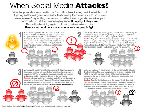
For example, below is an infographic about what happens when social media attacks. Social media! Fights! Your head is probably bursting with all the compelling ways to visualize that. However, the infographic below doesn’t really “illustrate” any of it. Instead, the author just tells you what it is they want you to know. Useful info? Probably, if you can make out that text and consume the message. Otherwise, it gets a little lost. If you can’t visualize your data, you’re not creating an effective infographic. You’re just playing with your numbers.
2. You have bad design
There are a lot of really poorly designed infographics circulating out there. Like, almost impressively so. If you know that you’re going to be producing infographics on a regular basis, or even if you’re just going to launch one and see how it goes, it’s worth doing your homework and finding a designer who feels comfortable in the art of visual storytelling. Because that’s what this is and not everyone is going to be able to adapt to the infographic format. When it comes to designing your infographic, you want to do your best to ensure:
- Is it even? Is the data evenly distributed throughout the infographic or is it feeling to top-, right- or bottom-heavy?
- Does the visual theme you’re using make sense for the topic and the message you’re trying to deliver? If this is an infographic about the number of cancer-related deaths, then you’re going to want to pick a more somber design than if it’s an infographic about your relationship with your best friend.
- Do your colors complement one another or are they off-setting?
- Are you doing justice to the data sets you’re including or are you throwing in the whole kitchen sink, putting emphasis on nothing?
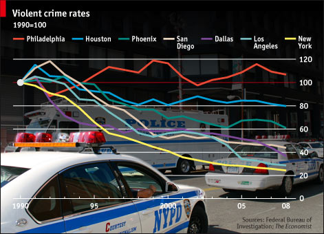
For example, The Economist compiled some compelling data a couple years back that looked at the crime rates in major cities. Who wouldn’t be interested in that? We all want to know if we live in a safe city or if we should be packing heat every time we walk to the grocery store. The problem with it? A bad design.
The flashiness of the background really didn’t help a user to consume the information. In fact it made it really difficult to read.
On the flip side, this recent Flowtown infographic about why Pinterest is so damn addictive feels even and properly laid out. The result? It’s easier to read and consume.

3. There’s no “so what”
I’m a big believer in the “so what”. This tends to be an issue for many of the infographics out there. We create these really cool visual stories, but there’s no punchline or call to action. There’s nothing to take away from it and learn. You wouldn’t (intentionally) write a white paper or come up with a marketing initiative that didn’t have a point or a message to your reader, so don’t do it here.
Sure, your tribute to the toilet may be kind of quirky but, ultimately, so what? What am I supposed to take from this piece of content? Just because you’re using visuals doesn’t mean you don’t still have to tell me.
4. Someone took too many visual liberties
Working with a talented designer will help to give your infographics the little bit of “oomph” it needs to tell an impactful story. But it’s up to you to have that final say over the design that’s being created and what will ultimately be used. Designers are fabulous people; even fabulous people need to be held back every now and then. Sadly, I couldn’t find a good example of this via searching (have one? Share it in the comments), but be on the lookout for designers who will want to take too many visual liberties in their attempt to get the message across. It may mean inserting things that you feel don’t belong, exaggerating data to be more visually compelling or simply trying to highlight the design over the message. Any contract you sign should take into account your rights as the owner of this infographic and what you’re trying to convey.
Don’t step on toes and stifle the process, but make sure the right story is being told.
5. You’re publishing just to publish
Well, are you? You’ve jumped headfirst into the world of infographic marketing, but for what purpose? If your infographics aren’t gaining steam or if you’re not happy with the results, it may be time to ask yourself why you’re publishing them in the first place. Because while infographics aren’t just a fad, they are if that’s how you treat them. I’m not accusing you, I’m just asking. ;)
What are some of the best/worst infographics you’ve seen? What makes a good one stand out from the pack and why are others shunned? I’d love to see some examples and, yes, you can promote your own in the comments if they’re worthy (or really, really bad!).


