 Hey. It’s a new week and you’re busy. So what do you say we just agree that your audience is trying to view your content via mobile and save ourselves the debate about whether or not it’s happening? Because it is happening, you stubborn fool, and you need to optimize for it.
Heck, I’ll even start with some numbers.
Even if you’re not using your phone to access the Web, your customers are. In fact, the number of searchers using their cell phones to hunt down information has grown 40 percent YOY. Pretty noteworthy, eh? Now take that number and understand that only 59 percent of users who search via mobile are able to complete their task, 21 percent LOWER than what it is on a desktop. And do you know why they can’t complete their task? It’s because you messed up.
You need to get your act together.
To be a site that doesn’t render in mobile is similar to not having a site at all. You don’t exist. And if you’re a content marketer – whether you label yourself a blog, a news site or you’re hawking a product– you can’t afford to be invisible. You need to be there and you need to optimize for mobile.
To make sure your site is seen, below are five content usability tips you should implement today.
Remove the bloat
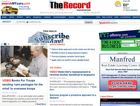
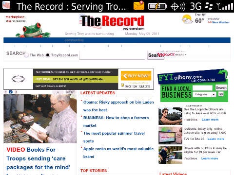
Below you’ll see two screenshots of the homepage for the Troy Record, our local paper. One screenshot is from the desktop version, the other is for mobile.
Desktop:

Mobile:

See the problem? They’re the exact same site. And that’s no good. Because while the giant headers, rotating images (oh yes, that man rotates), the video, and the large page size all work fine on my desktop, they full-out crash my phone. I cannot load this page properly. Ever. And there’s no reason for it.
You need to kill the bloat, recognize that I’m a mobile user, and give me only what I need. If you’re a news site, that’s likely the top headlines, weather, local news and link to access your full site should I want to go there. If you’re a blog, then it’s probably links to your last 4-5 posts. I’m on the go. If I wanted the whole kitchen sink, I’d go buy one.
Give full headlines
Another common error for content-heavy sites that don’t optimize for mobile? Truncated headlines galore! When this happens, in order for users to interact with your content or even understand what your content says, they have to do a lot of extra clicking or side scrolling.
Avoid this. It’s a roadblock and users don’t want it.
The more information you can give on one screen means less moving around for a user and a greater chance they’re going to find what they want. No, go read that second part of the sentence again. I bolded it for you. Realize that mobile users are users are on a mission. Your job is to make it as easy as you can for them to find exactly what they’re looking for. Or at least to make an educated guess.
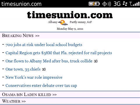
A hometown favorite who does this well – The Times Union, another local paper.

Full headlines, major categories covered, and I know which links contain media that may slow me down. Nerd bliss.
Use image icons to increase scannability
Scannability is vital whether we’re talking about the traditional Web or the new mobile Web since the general public has forgotten how to read. However, it’s even more important in mobile where stories are often preceded by generic date icons or station logos. When everything looks the same (and not particularly interesting), there’s nothing there to excite a reader’s eyes and make them want to spend that extra few seconds to take a deeper look. If you’re covering news, make sure each story has a unique image. We’re talking mobile, so don’t make it a giant image, but a small thumbnail or a picture of a person they’ll recognize is going to increase scannability and the way a user can interact with your page.
Anticipate what people want
You’ll notice up there that the Times Union isn’t just giving us weather, the top headlines and local news – there’s also a category specifically targeted the news around Osama Bin Laden’s death.

Why is that there? Its there’s because it’s a high interest item and the TU knows there’s a good chance its readers are looking for that content. For the same reason, the TU features news from popular TU Capitol Region blogs and other popular sections of the site. When you anticipate what people want and serve it to them before they can even ask for it, you win a friend for a life. Or at least a reader for one more session.
Make things bigger
Hey look, if you have an 18-year-old’s eyesight, I’m really happy for you. Truly. Unfortunately, the rest of us are getting older and the tiny screens found on most mobile devices really aren’t helping matters. Make yourself a champion in the, well, eyes of your audience by making things bigger in order to compensate for the spammer UI. In other words, there’s really no reason to cram information into a very small window. Make your text bigger, your headlines bigger, the icons bigger, etc. We don’t mind scrolling a bit; we do mind having to get the magnify glass out to see who won the Celtics game [All hail, Rondo]. I know it sounds like a small thing, and perhaps even like a silly thing, but it’s hugely important to your audience, and, you know, to you if you’re trying to get people to read and click on things.
Those are five things you can do TODAY to increase your content usability on mobile. Which are you doing? What drives you nuts.
[Oh. Hi there. Yes. We know that some of you still have issues viewing Outspoken Media on mobile. We’re working on that. The plugins keep breaking our site. Kthx. :) ]

