More and more, it’s becoming imperative for companies to provide a unified experience between their website and their social media outlets. With the never ending changes in Google’s algorithms and the mass exodus from building links to earning links, internet marketing is moving in full force toward a value packed experience for the customer, and social media is at the heart of it.
Social media is an enormous component to getting the full experience of any company’s brand. That’s why it’s so imperative that it is effectively integrated so that customers can be captivated and engaged no matter where they are or where they come from.
First things first: a shift in perspective
Social media needs to be a fully integrated part of internet marketing, not its own separate entity. There are a ton of moving pieces involved in building a brand, raising visibility (and rankings), providing value, fostering a community, building relationships, getting the word out, and making the sale. Social media just happens to be one cog in the machine.
This holistic view requires a >fundamental shift in perspective not only for online marketers, but for their customers too. Achieving success in web marketing is not just about SEO, and it’s not just about social media either. It’s about the whole picture: providing an ideal and rewarding experience for all visitors to the site while simultaneously using the right tools to help the company realize its specific vision and goals.
Working together
As a consumer yourself, and especially for SEOs who are most likely familiar with the challenges of attribution, you probably realize that there could be a number of channels explored before someone interacting with your brand becomes a customer (in an act widely known as conversion). It’s fairly difficult to simply attribute a “sale” to just your website, blog, or one specific social media channel. They probably all worked together to get the job done.
Because of the variety of entry points, the experience (and the conversion) could take place anywhere, so the experience has to be everywhere.
To that end, let’s start with a few basics on user experience. Keep in mind that there is WAY more to UX than I have mentioned here:
Figure out who your customer is and what they want
This seems like a no brainer, but it’s easy to think you know your customer and just get to work on a content or social media marketing strategy without any real data about who are they and what they need. It takes some work, but you’ve got to define personas and get to know the needs of your audience if you want to provide them with the best possible experience.
And then, once they actually become a customer, make a continuous effort to get their feedback so that you can maintain those relationships and continually offer an adventure worth coming back for (and telling their friends about).
Eliminate and enhance with value
What are the most significant tasks that your customer will need to accomplish when they come to your site? Understanding this will help determine funnels, user behaviors, and what your site needs to do in order to get your customers what they need.
Keep in mind, though, that every page on your website needs to have a purpose. Otherwise, what’s the point, right? If you analyze each page on your website, can you confidently say that it is chock full of value that your customers would want to engage with or share? If not, it’s probably time to eliminate or enhance some pages. Put all of your energy into a few more powerful pages rather than maintaining a bunch of thin pages that don’t provide any real value or experience for your customers (this will also allow you to better define goals and track them through hard data).
Same goes for the rest of the experience on other channels. Before putting anything on your website, blog, or social media outlets, ask yourself this question:
Why in samhill would anyone read, share, or like this?
We have found with our clients that providing an awesome user experience can be difficult, particularly when it comes to the necessary “services” type pages or other vital, necessary, but inherently dry content. Think about enhancing that content with some personality. Integrate a short (and authentic) video about the service or product (maybe even an interview with a customer or employee), a testimonial, or links to other good, related content that is relevant and valuable (even if it wasn’t you who wrote it). Say what you need to say, but if at all possible, do it in a way that doesn’t make your customer want to stick a fork in their leg while they’re reading it.
Let the sharing commence
We all know that making it convenient to share content from your website, blog, or social media outlets is imperative if you want your content and brand to spread from your first tier customers to second, third, and beyond. That does not mean, however, that you need social sharing buttons on every page of your website.
If you can control it, place the share buttons where they belong…on pages with content that is worthy of sharing. Then work to get those pages shared (a.k.a build links). That way, you won’t have a bunch of “share” boxes with zeros. Those lead to the impression that no one comes to your site, or worse yet, your content isn’t worth sharing. This is not the reputation you want to build for yourself. Believe it or not, convincing your visitors that there is value to be had is all part of the user experience, too.
Ok, enough of the schooling. On to the good stuff.
How to do it (well, almost) right
So, I’m a huge fan of the Chipotle brand. They do an amazing job of providing an enjoyable experience both on their website and in their social community. They definitely live and breathe #RCS. So much so that they’ve even created an annual festival that embodies everything they stand for as a company and a brand. Chipotle makes it hard not to love them (plus their naked steak burrito bowls are super tasty).
But here’s what I found most interesting: there’s an almost complete disconnect and inaccessibility between their thriving community/customers/fanbase and their central website. Maybe they’ve got something behind their strategy that I’m not seeing, but they certainly have not seamlessly integrated their social experience with their website. Instead, they’ve made it a bit of a hurdle.
Case in point:
This is their awesome website. Complete with access to great videos about their story and what they’re doing to change the world through food with integrity. I especially love how they’ve integrated FOOD WITH INTEGRITY as a main nav item. Instead of being buried somewhere in the ABOUT section, this is a bold way of showing that Food with Integrity is so much a part of who they are that it deserves a top spot in their site’s architecture.
But I digress.
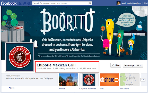
This is their thriving Facebook page. They have more than 1 million people in their community. It’s easy to make brand recognition here as the header image on Facebook is the same one from their website.
Same goes for Twitter. Chipotle’s got the brand consistency going on in their background (although it would be nice for them to switch to the new header and capitalize on that space as well).
Can you guess what’s missing?
Overall, Chipotle does a great job in their social media. They are responsive and really work to foster their community. Plus (and this is my favorite part) they’re not always about self-promotion. They’re really focused on giving back and making a difference in the local communities they serve.
The bummer is, that from their website, there is no way to easily access the greatness that they have cultivated on social media. You can’t even get to it from their home page (for the love of Pete). What if I wanted to engage with them and ask them a question about their Halloween promotion, or join their community? I’m going to have to dig to find those buttons or do the extra work of searching for them on Facebook or Twitter.
For a big brand like Chipotle who already has a ginormous following, that may not matter, but regardless, for user experience, it’s kind of a huge fail.
On the other hand…
The Chipotle Cultivate Festival does an amazing job integrating social on the festival website. And not just that. The overall experience is pretty rad (if I do say so myself).
Here’s eight reasons why:
- Good design
The design is beautiful (there’s even a rooster on there). - It’s easy to figure out what they do
In about 2 seconds you can tell what the festival is all about. It’s free, and there’s gonna be ideas (cool), food (yum), and music (yeah!). - Social and sharing is easily accessible
Access to social is front and center (well a little to the left) which makes it easy to jump into the community. The icons get the real estate they deserve. There’s also the convenient “share” option to spread the word. - Simple nav and responsive design
The website is really just one page which makes the nav simple and easy to utilize. It also makes the mobile experience pretty convenient. - Direct funneling to necessary info
There are two festival locations and you can access any information you need to know about the festivals by clicking on a link (that takes you directly to the info you wanted, not just the home page for that festival where you would then have to dig to find what you came for). - Dedicated social outlets/handles
They have a Facebook page and Twitter handle dedicated to the festival itself (separate from the Chipotle main website and social) so you can engage and interact with the community that has been built around the event. - Easy to engage and follow the conversation
The Festival page has their social feeds completely integrated into the page so that you can see activity on Facebook and Twitter (without leaving the site of course). - Call to action
When they are gearing up for the event, Chipotle’s main website is getting the word out with a call to action as well.
See, pretty fully integrated and awesome.
Job well done…except for just one tiny thing
In my humble opinion, the Chipotle Cultivate Festival website really allows the customer to experience their brand and feel as though there are no barricades between the website and their social.
They could, however, integrate the website URL into their Food/Beverages description so that there is easy access to the website from the header on their Facebook page (bringing the customer from social to the website).
Like they do on Twitter:
It doesn’t take much to get it right
There are a lot of pieces that need to be put into place to get user experience right on a website (way more than I’ve explained here), but even more so when you’re working to embrace social as well. But all in all, it’s simple stuff to ensure your customers are getting a really great experience, and above all, an ideal taste of your brand (no pun intended).
What other great examples of social integration are you seeing? I’d love to add them to my list.