 QR codes are exploding. They’re on posters, window storefronts, coasters at the bar, and some businesses are even putting them on billboards (hi, your customer is DRIVING!). But what I’m noticing even more than the sheer explosion of QR codes is that often the QR code campaign is doing little more than embarrassing the brand it’s associated with.
As you may have guessed, I have an example!
Tech savvy as I may be, I’m not typically the type to scan a QR code. As a lady who can never find my phone in my purse, it just seems like a lot of work for very little pay out. However, I’m a sucker for Bill Cosby. He’s funny, he’s inspirational, and he brings back delicious childhood memories of pudding. So when I noticed that the back of his new book I Didn’t Ask To Be Born (But I’m Glad I Was) (no aff) had a QR code on the back I thought, what the heck? This has to be good.
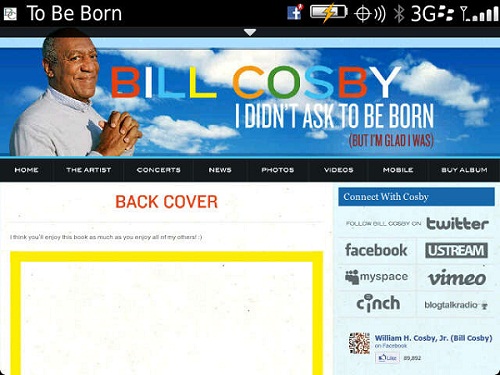
Five minutes later after I finally found my phone in my purse, I scanned the bar code. What did I get for my troubles?
This.
I WILL STAB YOU!
The QR code led to a page with a giant video on it. A video that I can’t play via my Blackberry Bold. I waited a few seconds to see if something else would pop up, if there was something below the video (there’s not) or this page had anything to offer me other than a collection of Mr. Cosby’s social networking profiles and tweets containing his name. And when I realized it did not, I threw my phone back into my purse’s abyss, put the book down, and walked away.
Mad.
Would I have purchased the book had there been something on that page that blew my socks off? I can’t know for sure, but there’s a good chance. I was emotional, I was in the buying mood and I was interacting with a brand that already had my trust. But I didn’t take a second look at the book after I felt like my time had already been wasted.
Of course, Mr. Cosby isn’t alone in creating a lackluster QR code experience. It’s very often the norm. To help combat that, below are seven tips for creating a better one. So people maybe don’t go away angry. Or, you know, go away at all.
7 Best Practices For Using QR Codes Successfully
1. Remember that QR Codes & Non-Mobile Content Don’t Mix
The goal of creating a QR code is to attract and create an experience for an on-the-go consumer via their mobile device. That means the content you send them to must LOAD on their mobile device. Avoid the Flash, the large images and Web site bloat. The content you’re directing people to should be optimized for a mobile device and focus on that mobile experience. Don’t lose sight of what you’re doing because you’re trying to wear your fancypants.
2. Have A Purpose For Your QR Code
The “QR” in QR code stands for “quick response”. Think about that and let it guide you through your use of this mobile technology. Think about what kind of “quick response” someone may need from your brand.
If you’re a real estate agent, maybe you want to put a QR code on the bottom of your For Sales signs to allow interested parties to get additional information about the listing they’re looking at. If you’re a local pub, then putting a QR code on your coasters to allow people to view your beer selection or your daily specials may be worthwhile. The key is to serve quick information that is contextually relevant right now.
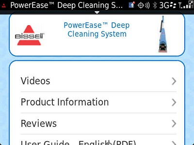
Or if you’re Bissell trying to sell me a deep cleaning system, maybe use a QR code to direct me to videos, product information, reviews, and a user guide. Actually, that’s exactly what Bissell did and, hey, I purchased one on Sunday.
3. Match Your Content To The Purpose
When The Red Cross created a QR code to encourage people to donate to Japan relief efforts they created this QR code to get the message across.
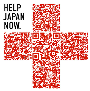
When scanned, users were taken directly to a donate page. The code matched the intent matched the call to action. Message received.
4. Focus On The Experience
More than just having a purpose for yourself, have a purpose for me. Give me something that is worth the time it takes me to dig out my phone, scan the code, and then wait for something awesome to pop up in my browser. For example, I was surprised to find out after the fact that Bill Cosby has a mobile app. Through the app, users can get candid photos, audio books, exclusive videos, his concert schedule, and other types of premium content.
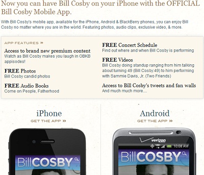
HELLO!
Why am I not seeing THAT when I scan that QR code? Why am I not giving a taste of the premium content available through the app? Or a free chapter of the book I have in my hand that I can read to pique my interest even further? That would make sense. It would be interesting. And it would keep me interacting with Bill Cosby. Directing me to a video that I can’t load (a video that, as it turns out, isn’t interesting anyway) is definitely not going to lead me down a path of conversion.
5. Size & Placement Matter
The quickest way to ruin the QR code experience that you spent so much time crafting is to place that QR code in a situation that just doesn’t work. For example, like placing a QR code on a billboard when your customer is driving and won’t be able to scan it because they are driving. Or placing your code on a post, which is then wrapped around a pole, making it impossible to scan. If someone can’t scan your code, you’ve lost them.
You also want to take size into consideration. QRStuff.com recommends using a simple formula:
Minimum QR Code Size = Scanning Distance /10
Any smaller than that and your users are going to have a difficult time scanning properly.
6. Set Up Tracking
Don’t leave yourself with no way to track what you’re doing. Once you define your purpose, create a URL that you will only publish via your QR code so that it’s easier for you to track and measure later. This will allow you to keep record of how many people scanned it, when they scanned it, what days were post popular, the IP address, etc. All of this information can then be taken and either used to improve your next QR campaign or help you realize you need to reevaluate what you’re doing.
7. Test Your QR Code
Before you send that QR code into the wild, test it to make sure it works the way that you want it to. Is the page you’re sending your customers to mobile-friendly? If they have to take any additional steps once they’re there [enter an email address to redeem a discount, like your Facebook], are they able to accomplish these tasks? This may seem obvious, but as we saw with the Billy Cosby example above, not every brand performs the proper tests.
QR codes give brands the opportunity to hand deliver customers quick nuggets of content that are timely and relevant to them in that moment. But they only do that when used correctly.


