You’re working on your New Year’s Resolutions, right? Run every day, talk more to distant friends, and stop eating cake for breakfast, right? Let me suggest a small addition to your ever growing list: use good judgment. It may seem obvious, but in our industry good judgment can mean the difference between success and failure real quick.
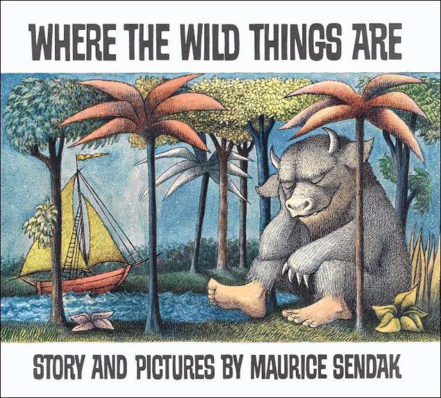
In my spare time, I review children’s books. I swear that I can read at an adult level, it’s just that sometimes I prefer to curl up with a fantasy YA novel. I’ll spare you any long-winded explanation on why I think it’s important to invest time and energy into a genre that most of my peers stopped reading decades ago, but I will tell you that I have more picture books than your average family of four. What does this have to do with SEO? At first glance, nothing at all. It’s not like reading Where the Wild Things Are is going to give you some secret link building tactics, and yet, on closer examination, the process of judging quality is uniform across industry, genre, and subject.

As I’ve settled into the practices of organic link building at Outspoken Media, I’ve realized that although I didn’t start my work with the same SEO background as my peers, I do have a background in reviewing quality that serves me well. Every industry has its metrics for quality– when I review a book, I have a tangible scale that I use to judge each book. In the SEO industry, we have a lot of tools at our disposal, possibly too many, that allow us to assign a value to links whether that be ACRank, PageRank, MozRank, Alexa Rank, etc. Although I’m a huge fan of tools, I’m also an advocate for the human end of evaluation.
As marketers, link builders, and savvy Internet users we are constantly judging the quality of the sites we encounter, and we rely on something a lot more uniform than any formal link evaluation process– our intuition and experience.
I realize that a website and a book are not perfectly analogous, but they aren’t apples and oranges either. Beyond the obvious comparison, that a book has a cover, and a website has a landing page, and each only has a few moments (like it or not) to dazzle, there are many ways that trust, authority, and likability are built in subtle ways with a user or reader. As Internet marketers and SEO consultants, we need to look beyond our tools and think about quality in a more intuitive way.
Presentation
When I look at a book my first impression is crafted by many small elements that might not seem like much, but all together they tell a story about the care with which the book was put together. When we look at a website as SEO’s, a lot of those same elements should influence how we judge its quality.
- The Cover I’m not advocating judging a book by its cover, but I also think that it’s naïve to think that first impressions don’t matter. When I look at a cover, I’m looking at the illustration, the font choices, the way that space and color are used. Each of these elements should entice the reader. I’m deciding if the book is doing a good job of making me want to read it.
- The Construction If the book is a hardcover, I’m going to pull back the dust jacket (whoo!) and see what’s underneath. I’m going to look at the binding and see if it’s sewn, glued, or stapled. I’m going to look at the quality of the materials in the paper, and in the cover. I’m looking to see if the book was cheaply put together, or if the publisher put care into its creation.
- The Design Inside the pages I’m looking at how the book was designed; if it’s a picture book I’m looking at the interaction of illustration and text. If it’s a novel, I’m looking at fonts, how the text wraps, and any other design elements the book designer may have added.
At its best, a good presentation elevates a book and makes it a cohesive whole. Each of these presentation elements gives the reader information about what kind of book she is going to read before she’s even made it to the first paragraph or word. A website has its own set of presentation elements that convey similar information. When we approach a website to evaluate we are going to use tools to get information about Trust Flow, Citation Flow, or PageRank, but we are also already making judgments about the quality of a site the second the page loads. So are the prospective users of that site.
A website may not have the same tactile qualities that a book has, but its landing page, navigation, layout, and design all work to present the website in a certain manner.
- The Landing Page On the landing page, the way the interplay of text and image, as well as color and space work, should make the user want to engage. A good landing page should have a clear call to action. It should use image and text to convey trust. In the same way that a book makes you want to read it, a landing page should make you want to convert.
- The Navigation With a website, the construction is all about navigation and user experience. What information is easily available, and is it the information a user will likely be looking for? Does the site have intuitive navigation?
- The Design Just as a stapled binding and poorly designed cover may turn a reader off, stock photos, or ad heavy content may instantly turn a user away from a site. Similarly, just as a hardcover book with thick cotton pages is going to have a certain appeal, so is a site with responsive design, or a well thought out user experience.
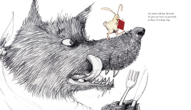
One of my favorite books from the last few years, Emily Gravett’s Wolves, does such a good job of tying together the book’s content and its presentation, that the reader has the wonderful experience of briefly believing they are part of the book. The book follows the journey of a rabbit who takes a book on wolves (a book that mimics perfectly the look of Gravett’s picture book) out of the library, and is hunted by one of its subjects.
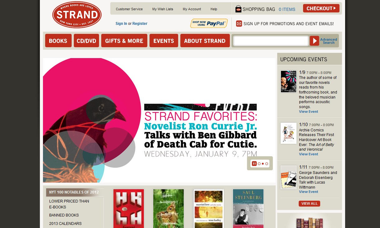
It’s a book that you can’t resist reading, and the pinnacle of what any good book or site should do–draw you in instantly. To stay in a theme, a site that accomplishes the same task (with a little less predator/prey relationship) is The Strand. The landing page instantly engages with colorful design, and well thought out extras like events, staff-picks, and 2012 Notable Books. It draws you in, in ways you may not have anticipated, which means more time on site, and possibly more items in the shopping cart.
Audience
When reviewing a children’s book, the question of audience is a tricky thing. Every book has its intended audience, from picture books with just a few words intended for babies and toddlers, to YA novels intended for teens (and lately middle aged moms). The practice of writing for an audience that you aren’t a member of is what makes it so interesting. Most authors of children’s books are adults, and so much of the time the process of writing for their audience requires an imaginative approach. As a reviewer I have to judge not just whether or not I enjoyed the book, but how the intended audience might.
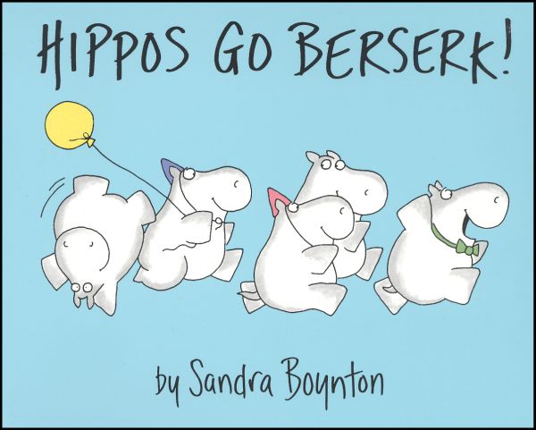
For example, Sandra Boynton’s Hippos Go Berserk! has a clear intended audience, and it delivers appropriate content for that audience. It engages with bright cheerful illustrations, and fun action based text meant for young children. If instead of going berserk, the hippos had a lengthy conversation on feeling alienated by their peers, or boys they had crushes on, Boynton would have missed the mark.
A website’s audience doesn’t work in exactly the same way, but it is something that we should look to when judging the quality of a site. The core question in judging audience engagement is not just, who is it meant for? but are they responding? A site should have content that’s engaging for its intended audience, whether that audience is moms, lawyers, college professors, or tech enthusiasts. For example, if your company has two completely different audiences you are trying to target, you may need two different sites.
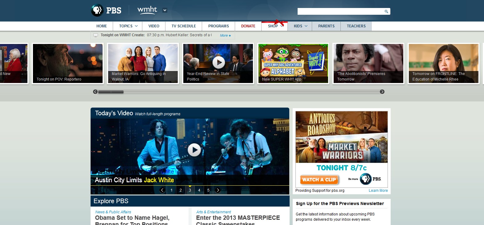
PBS has some great offerings for both adults and kids, and they also understand that those audiences are looking for two entirely different things. Each user requires a different layout, navigation, and design. You just can’t mix Downton Abbey and Clifford the Big Red Dog.
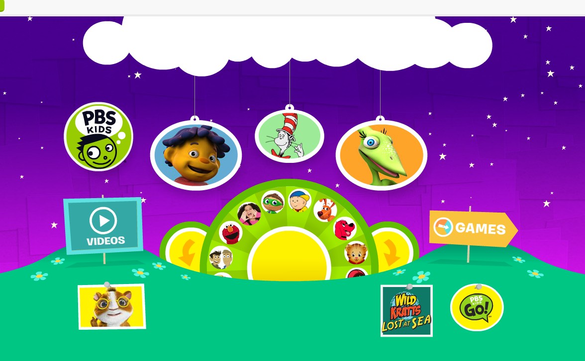
versus
Beyond appropriate content, a quick look at audience engagement will show you whether or not the site is successful in its intent. If there is no engagement, be it comments, shares, or other social media interactions, then the audience is not there. The website is writing to an empty room.
When we talk about metrics, concrete tools and measurements come to mind. If we are being honest about the way that we look at quality though, instant and lasting impressions matter too. We need to treat the sites we are judging as an experience, the way that we would judge a book.