What’s up, Internet?! It’s time to talk about usability while I nom on a delicious muffin that I pocketed from breakfast. Muaha, don’t tell anyone I stole but it sure does taste like starved-blogger heaven.
Up on stage we have the always awesome Gordon Hotchkiss with speakers Scott Brinker, James Fenelon, Kimberly Krause Berg, and Alissa Ruehl. Next to me is Virginia Nussey liveblogging for Bruce Clay, Inc. I’m going to throw parts of my muffin her way to distract her. Competitive streak? What competitive streak? [I’m kidding, Internet. I heart her.]
Up first is James Fenelon. I may or may not have been told to (kiddingly!) give him a hard time. I won’t say by whom. But he’s sitting next to me and works with the aforementioned. And his name is Pratt.
Usability testing provides measurement of ease of use and user success. Or, in English, it tells you WHY someone is dong something on your site. It helps you to test subjects to see how long it takes them to do something, if they can accomplish it, and if they can even find the information you want them to. The greatest benefit is that you get the info firsthand from users. It saves time in discovery of errors and areas of improvement, sales development time and money. It also reduces guessing and arguing. Personally, I like the arguing.
Why is usability important?
A user takes only 1/20th of a second. Users only spend an average of 27 seconds on a Web page. People only succeed on the Web 66 percent of the time. You need to give them what they want and give it to them quickly.
Usability is about helping site vistiors accomplish THEIR goals. Start by defining:
- Business goals: Your business objective for the site. what you expect the site to accomplish.
- Visitors goals: The goals for the site that come from the outside. Specifically from the people who will use the site.
Usability testing for conversion optimization can range from guerilla techniques to full lab environments. Some basic techniques include heuristic reviews, card sorting and prototype testing.
Heuristic Review: An evaluation method that helps to identify usability problems with the user interface. It provides user experience and usability issues. Prioritizes identified issues, recommends to resolve those issues, and aids in the prioritization of product development direction. Information architecture is the arrangment of content elements within the site that provide users the organizational and navigational elements of the site.
Questions to ask yourself:
- Is the menu naming terminology consistent with the users perspectve?
- Are navigational titles clear and mutually exclusive?
- Are items groups together?
Card sorting: A great way to validate your IA is through card sorting. Take a stack of index cards, label them with your type s of content, and then ask each user to sort the cards and tell you what they would call that pile. [Rhea made me do this once. It was fun!]
Prototype Testing: The process of putting together a working model in order to test aspects of a design. Allows you to make quick iterations of your design. If you see a trend early on, you can update your theory and test it as you go through the day’s sessions.
When to do usability testing?
The earlier in the project the better. Any usability testing is better than none. Usability for optimization is not a one-time activity.
Next up is Alissa Ruehl.
Every Web site is a unique and special snowflake and has a lot of unique and special problems. Your Web site is probably Frankenstein’d together. Your first step is to dig in and understand your unique site problems. You can’t fix what you don’t understand.
Step 1: Goals – What are your goals? If you haven’t clearly identified that, stop, do not pass goal. Do not collect $200. What is the purpose of your site? Web leads, sales, phone calls, visits, engagement and awareness, distributing information, etc? It’s probably a mix of all of the above. Optimize to ALL of your goals.
Step 2: Whats your traffic doing today? –
- eCommerce: Start with the purchase process because that’s probably what’s most broken. Do people abandon? If not, move on. If they do, then your shopping cart may be your problem. From there, move on to the purchase process. How many people engage with the site but don’t add anything to the cart? Go through your product selection and purchase process. Ask where you’re sending your traffic. Is it going to your home page or to product pages coming from PPC pages? Where do you need to build landing pages? Where do people abandon: the checkout process, adding to the cart, finding the product, after reading the landing page, immediately? Focus on your biggest problem areas first. Use a tactic that fits the issue.
- Lead Generation: Are all leads created equal? You want to increase your leads, but you also want better leads. Instead of focusing only on Web forms you could track past the lead and analyze and optimize towards. Human scrubbed leads, qualified opportunities and sales. Lead Generation Issues: What do people do when they enter your site? Do they fill out forms quickly? Do they browse around to their pages? Do they read the page, but don’t go to others? Or maybe they leave immediately? How’s your lead bait? It never hurts to focus on your forms.
Conversion Strategy Summary
- Dig deep to understand and optimize towards your goals
- Use your analytics to find your unique problems
- Tailor the therapy to the type of problem
- Look at level of difficult compared to level of impact
Up next is Kim Krause-Berg.
It’s difficult to convert traffic to sales when you haven’t figured out what your Web site is expected to do and who will use it. Line up your ducks. Get your project managers involved. Organize and plan your site. Use napkins and sticky boards. Write everything down. Get the team to sign off on it. Use Test cases and guidelines.
Business Requirements
- Sell products online
- Provide information on our company
- Provide excellent customer service
- Be accessible to everyone
These are called “Parent” Requirements AID in IA.
A business requirement is a goal or primary use, such as provide services, inform, offer search services, building a community, etc.
Kim lays out a real life business requirements format.
- BR2.0 Providing Company Information
- Br2.1 About Page: Provide bios for all staff. Write President’s message
- BR2.2 Blog: Global reach. Host ads.
- BR2.3 Catalog: PDF Version. Subscription
- BR2.4: Social Networking
Functional requirements refer to technical issues. They’re derived from user cases, mental models and user personas.
Determine specs for browsers, OS, accessibility, bandwidgth, performance, platform, mobile use, programming.
[There are lots of crazy acronyms on the screen that are not registering. Who knew a session was going to be this technical? My brain hurts.]
Kim includes social media requirements into Web sites because she thinks it’s really important. It’s part of the marketing process. There are a lot of usability things to take into consideration for social media.
Her favorite part of REQ Docs is the stakeholder sign off part. It comes in handy when they question you and helps you cover your ass. You can also use the REQ docs to create site guidelines.
[I think Kim is going to break some of this down on her blog. Frankly, it was about 80 percent over my head. Kim is obviously far more skilled on usability than my brain can even handle. :) ]
Up next is Scott Brinker.
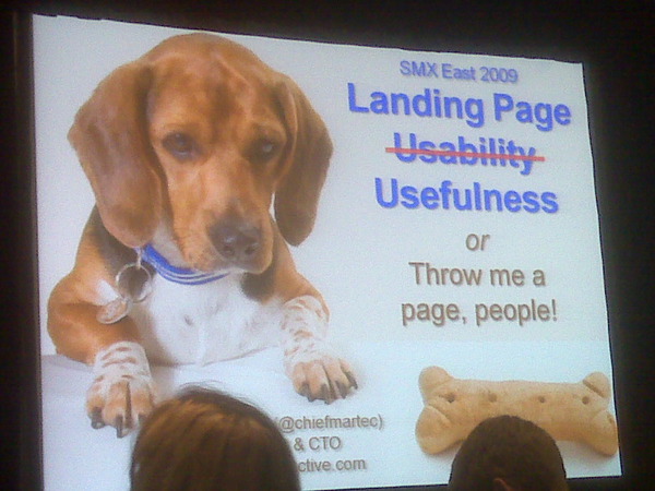
 Scott’s presentation is FILLED WITH PUPPIES! I love him.
- Option A: Technology and psychology to “optimize” them to convert.
- Option B: Give them what they really want.
There’s a great tale in Aesops Fables about The Man, The Boy, The Donkey. Essentially the moral is that if you try and please all, you will please none. He says the donkey was the problem, not trying to please everyone. You can please everyone, you just need more donkeys. Google isn’t making us stupid but it is making us impatient. People expect on-demand information. When they’re clicking on ads, that’s their first impression of you as a commercial organization.
There’s a wonderful connection between landing page, ad copy, intent and keywords. Someone does a search for [data duplication]. They see your ad, the Title tag says [data duplication] it looks relevant. One click gets them to the information they were after and they say, “Thank you, that was EXACTLY what I was looking for.” That’s the goal.
When his client moved to a highly targeted landing page it inreased their conversion rate 4x to 16 percent. How many landing pages do you need? Creating more landing pages won’t harm the rainforest. You should be creating hundreds. Yes, hundreds.
Case Study: American Greetings successfuly deployed over 700 landing pages during a 5 month period. They saw a 30 percent increase in conversion rate and a 20 percent decrease in CPA. They had new pages deployed in hours.
Creating 6-7 landing pages a day may sound like a lot, but how many search ads to you create? As search marketers, volume is often your job. Its is humanly possible.
7 Steps to landing page flying machine
- Adopt some kind of CMS for landing pages
- Create a set of reusable design templates
- Establish a library for branding and match art
- Standardize data collection and analytics
- Use parametrized Flash
[Yeah, I know, I missed two. He is FLYING through his slides, which is sad because they’re hilarious and awesome. I’m trying to make my fingers move faster for you. I’m sorry.]
3 Ways to juice your search marketing with landing pages
- Message Match
- Campaigns and promotions: Sales promotions work . Being able to get some immediacy of action bubbling up into your search marketing because you’re able to fulfill it is good. Users don’t have to hunt for the sale, you’re putting it front and center for them.
- Test-driven marketing: Controlled experiments to discover what people really want. It’s an option for marketers to become less risk-averse. You get to the point where you can take bold ideas and run quick tests. Your down time is incredibly small.
Find what they’re looking for and give it to them. That’s landing page usefulness.
z0mg that was a lot of information. Now to go talk cheezburgers with Ben Huh.


