 We hope you had a beautiful end to the summer this Labor Day weekend! In upstate New York we’re already celebrating Autumn with hot apple cider and pumpkin donuts. It’s one of our favorite things, just like today’s guest poster, Ian Lurie, is one of our favorite SEOs. The founder of the Internet marketing company, Portent Interactive, Ian is equals parts brilliant and outspoken (no wonder we love him!). Today he combines both to give us the “6 Deadly Sins of Data Visualization.”
You’re a marketer. And half your job is marketing your ideas. Like it or not, you have to be good at proving your point, ‘cause being right isn’t enough. You have to justify the time, dollars and effort required for your internet marketing campaign. In the meeting room struggle for resources, your best weapon is great data presentation.
So why do so many of us suck at it?
I blame my liberal-arts education. I majored in History. My first 2 years of college, I memorized more dates and trivia than Alex Trebec. It wasn’t until I hit the higher-level stuff someone explained that events tell a story. Folks more easily follow a story told visually than one told verbally.
Want to get better? Avoid these six gigantic visualization mistakes:
1: 3D madness
Before the TV manufacturers convinced us we need crappy 3D for our homes, presenters decided that charts are always better in three dimensions. I beg to differ. 3D may let you cram more data into a single chart, but it doesn’t help:
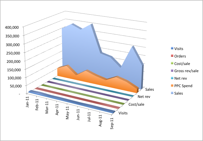
What. the. hell.
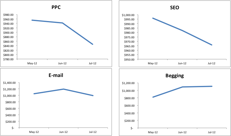
Just because you have a tool doesn’t mean you should use it. Instead of using 3D to break up data or, even worse, using 3D for no reason at all, stick to flat, simple 2D graphics and use small multiples to compare different series:
2: Chartjunk
Edward Tufte coined the term Chartjunk. It describes all the crap folks shove into a chart, apparently to make it more ‘attractive’, ‘striking’ or ‘eye-catching’:
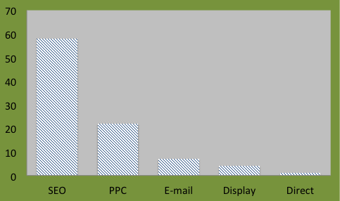
GAAAAH MY EYES!!!
By the way, ‘striking’ and ‘eye-catching’ are words bosses have thrown at me as reasons for optical splinters like the above chart. May I suggest a simpler layout that looks less like a hairdo in a 1980s John Kusack film (I loved Better off Dead, but the big hair…):
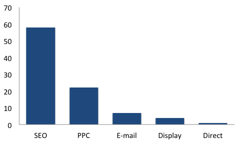
Isn’t that better?
3: Worthless data
I’m not doing a chart for this one. But the next PPC agency that tries to justify their existence with a unique visitors chart gets a thumb drive up their left nostril. Show me what matters.
Stopping now.
4: Data propaganda
At first glance, this chart shows a pretty sharp upward trend:
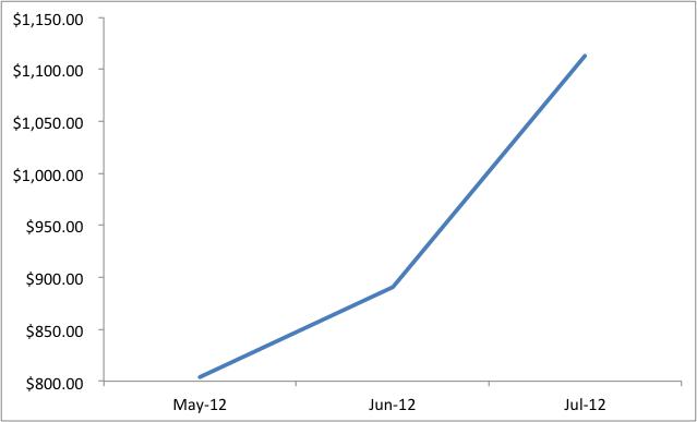
Double down! Triple down! Whatever this is we want more of it!!!
Unless you look at the scale. It doesn’t start at zero. I totally understand why someone would do this. But you need to call it out, or start with a chart that shows the scale from zero. Otherwise, you’re just doing data propaganda.
It is your job to tell the story in the data. It is not your job to make up that story. Get the difference?
5: Riddled with bullets
One of the most heartbreaking examples of failed data visualization comes from the Space Shuttle Columbia disaster. Mission control saw the foam strike the Columbia’s wing on liftoff. They asked an engineering team to evaluate the problem. This is what they got in return:
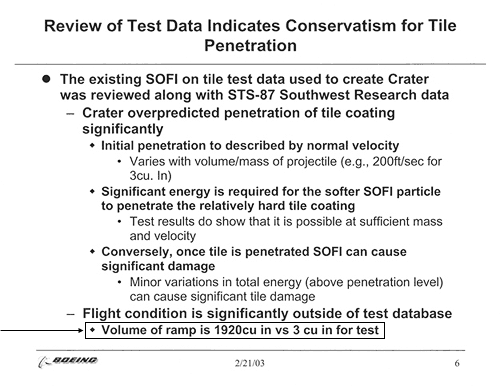
From https://www.edwardtufte.com/tufte/discourse and the New York Times
Am I blaming the engineers? Hell, no. But the critical datapoint here was hidden at the bottom of the page: The foam that broke off on liftoff was much, much larger than anything in their tests. History is full of times where one piece of information could’ve changed everything, and that data was in front of the decision makers. Count this as one more time.
Don’t use bullets if a drawing works better:
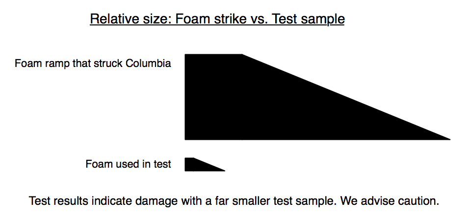
Hopefully, no one’s lives will ever depend on it. But clarity is always worth creating.
6: Being lazy
How exactly does this prove you’re worth a damn to me?
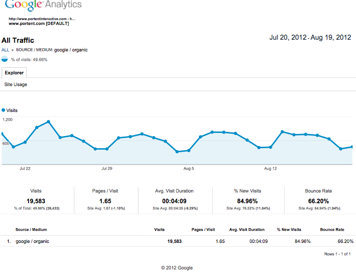
It doesn’t. It’s an export from Google Analytics. It has zero analysis, and zero insight. I can get this myself. This is the worst of the visualization sins: Not actually visualizing anything. As a marketer, you’ve got all the power to help me see my company’s next steps. Use it. Don’t waste it.